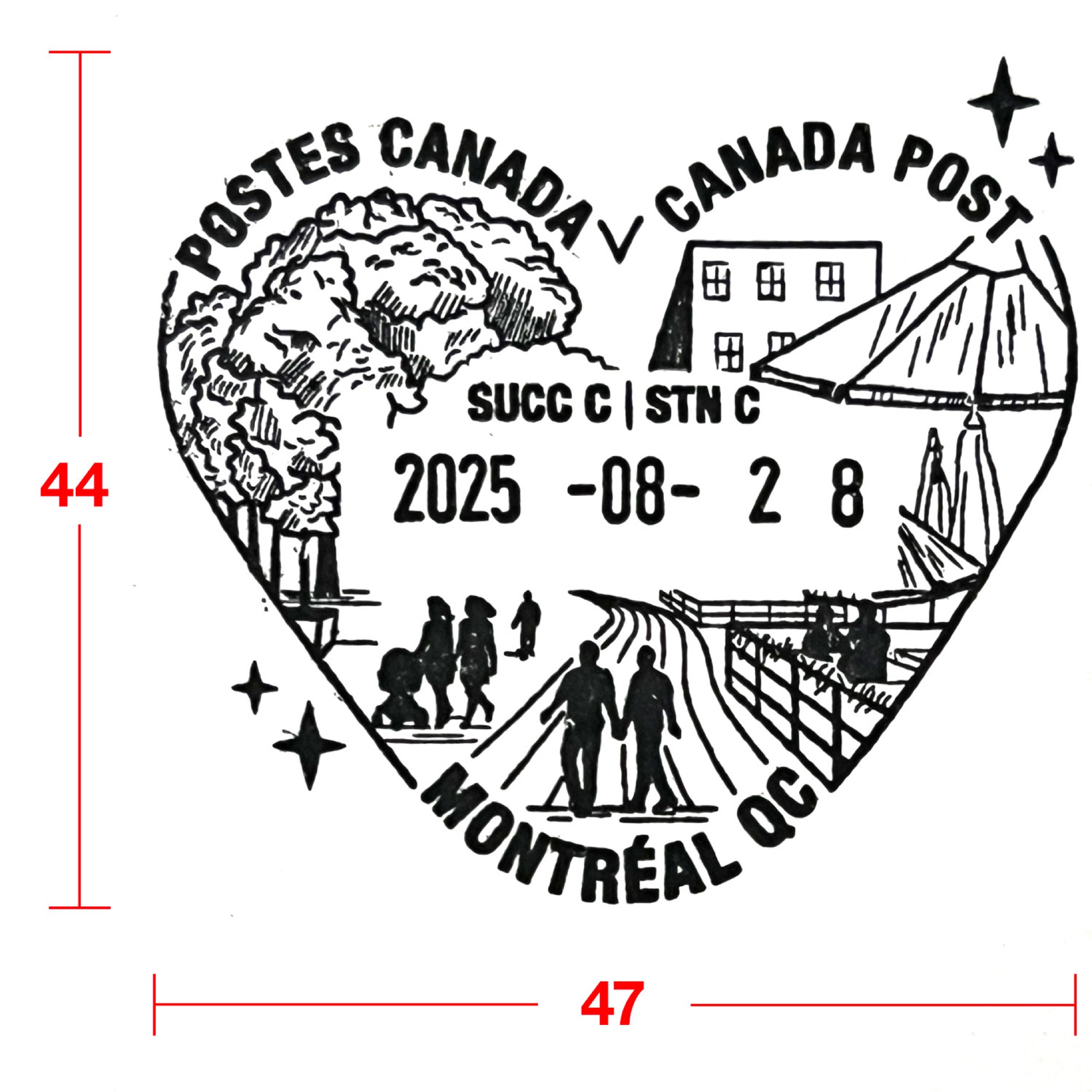
The article follows my cachets d’oblitération for Montréal post offices — from the heart of the Village to the REM and the Jardin botanique — and touches on my wider philatelic projects, from Stamp Out War to the Hiroshima survivor-tree maxicards.
You can see the cachets themselves on the Postmark Designs page.
First, I have decided to open an online Etsy store to sell my artworks or the reproductions thereof. The first product listed is my 2021 photo book Roads Go Ever Ever On. There will be more to come, including original artworks, limited edition giclée prints, postcards, and so on.
Craft machine
Second, lately I have invested in a 4-1 crafting machine that can do laser-engraving, inkjet-printing, pen-drawing and blade-cutting. This means that I will be able to self-produce craft items of my own design and items engraved with my own drawings / photographs. I am still experimenting what I can do with this craft machine.
Originally, the first draft of my design looks like this:
The composition makes use of an exaggered perspective by which the part of the wing that is closer to the camera (viewer) is proportionally enlarged. This technique is often used by Haikyu!!’s author Haruichi Furudate. For instance, in the following illustration, the camera is placed on the top, above Hinata’s head. Hinata’s left hand looks stretched toward us (the viewers) and his head (that is closer to the camera) is proportionally bigger than his feet (that is farther away from the camera).
In the next illustration, the camera is again placed above the players: Kageyama’s arms look stretched with the finger tips (that is the closest to the camera) very exaggerated.
From the manga/anime, one classic shot I always remember involves Oikawa making a long toss to the ace from outside of the court. In this shot, the camera is placed at Oikawa’s left side, close to his fingers, so his fingertip is accentuated and enlarged, and the entire arm looks very long:
In my first drawing, I think the feather tip of the dove’s left wing should be bending towards us the viewers (and the camera) if this exaggerated perspective is to make sense. But the composition makes it looking like the bird was photographed exactly from the side, and the sense of relative distance of different elements to the camera was failed …
Hence, I decided to redraw the bird after all, because the effect I wanted to achieve is far from being obvious. This is the final version of the main graphics showing a peace dove flying in the sky:
It was later be laser-engraved on wooden plywood. As the project references to postage stamps, the contour is cut into a shape that resembles a traditional stamp.
I choose to use colour acrylic to make the name of the project and the circle representing the sun in the background standing out. Reusers can experiement materials of different colours and qualities (opaque vs. transluscent, mirror vs. regular, etc.) to achieve the desired look.
The colour elements were designed to fit the holes, but to prevent them from falling apart, I chose to use Gorilla glue to strengthen the bonding between the plywood and the inlay.